 Skip to content
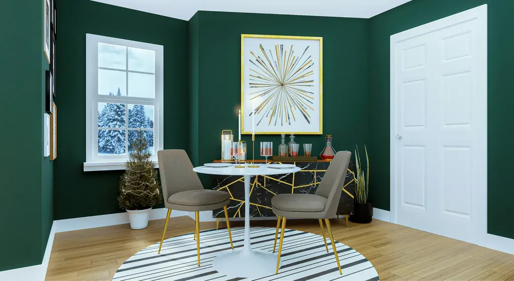
Choosing living room colors can feel a bit like scrolling through a dating app. Every shade seems perfect until you picture it living on your walls for the next decade. You flip through interior paint color palette ideas, squint at how each hue behaves in natural light, and wonder why that perfect greige suddenly reads green at sunset.
Meanwhile, your plush furniture keeps whispering that it deserves a fresh coat of sophistication, especially in high-traffic family rooms where sticky fingers leave their mark. Rather than juggling endless color chips or committing to yet another swatch of off white, lean on Peach Painting to add a truly luxurious touch to the most-lived-in room of your home.
Designing an Inviting Space: Living Room Paint Color Fundamentals
Creating an elevated space starts long before a brush ever dips into a can. A seasoned color consultant weighs your next project wishlist against what’s already painted, studies existing furniture, and pulls inspiration from your favorite design accounts.
From there, interior painting experts gauge how a bright tint will create energy or how muted undertones add gentle life and effortless style. They also map out furniture flow, sightlines, and traffic paths, ensuring the layout stays cozy even after a full family movie night.
Well-chosen pigment enhances every moment without stealing the show. When you strike that balance, you never have to worry about a sofa clashing with an accent wall or a trendy shade ageing out before the warranty does.
How to Choose Living Room Paint Colors That Endure
Timeless living room paint colors remain chic, flattering, and tough to beat. A properly vetted palette hugs the walls in harmony, respecting the architecture of your house and delivering a warm glow that genuinely matters.
Drawn straight from nature, these hues stay soft, allowing art pieces, rugs, and throw blankets to pop while maintaining overall balance. A classic neutral doesn’t stop at the baseboards either; local painting professionals extend the scheme to the ceiling so the eye travels smoothly upward, giving every corner a polished presence. Plus, color fastness matters in Florida’s subtropical climate. When sun, salt air, and humidity collide, only professional-grade products keep undertones honest year after year.
The Best Living Room Colors: 5 Classics That Shine
Ready to see the best living room colors that never betray you? Here are five shades that designers and homeowners keep on speed dial.
1. Soft Off-White Elegance
A creamy backdrop may sound predictable, but subtle off-white reads bold when paired with dramatic art. The shade also spotlights architectural features like a statement fireplace, allowing vibrant canvases to complement the full range of tones within the room. Most importantly, off-white sets an adaptable mood: swap pillows, curtains, or décor and the vibe changes instantly.
2. Warm Beige & Greige Comfort
Earth-toned neutrals have inspired countless makeovers because a sophisticated beige behaves like a style chameleon. This hue underpins colorful decor and glows under late-afternoon light, producing a gentle warmth that invites the whole family to unwind. Marks from everyday stains fade into the pigment, so you get longer stretches between maintenance and more time to rest with a good book.
3. Calming Green for Nature Lovers
Rich botanicals continue to trend for good reason. Green channels outdoor serenity without feeling kitschy. A medium-deep shade pulls surrounding foliage indoors, while a slightly deep note stops the color from feeling sugary. When carried onto French doors, the hue becomes an instant sign that the space is equally calming and sophisticated.
4. Classic Blue With Dramatic Flair
Few pigments age as gracefully as a crisp blue. The shade integrates beautifully with built-in cabinetry, adding just enough dramatic flair to transform a generic layout. Its balanced tone also fosters long conversations with friends, and the shade’s sleek finish invites metallic accents to play center stage.
5. Sophisticated Gray Balance
A streamlined gray treads that delicate line between warm and cool, embracing colorful décor while taming louder elements like an orange throw. The hue naturally suits many styles, showcasing your unique personality in a way that feels anchored and intentional.
By staying visually neutral at the center of the design, gray crafts a calm vibe and even tricks the eye, creating an illusion of higher ceilings and expanded square footage.
Living Room Paint Ideas to Spark Your Next Project
You’ve scrolled Pinterest, pinned every mood board, and still feel stuck from getting your ideal living room paint ideas. Before inspiration fatigue sets in, consider these quick thought starters:
- Think about the overall project goal: Do you want an energizing space or something relaxing?
- Go airy with light neutrals or experiment with subtle pastels if your layout feels narrow.
- Align the color vision with how often guests visit and the room’s sun exposure at different times of day.
- Blend a classic wall shade with bold wallpaper on one accent wall for depth.
These pointers help you refine what you love before any prep work begins.
Perfect Color Picks for a Timeless Living Room
When clients ask for foolproof shades, colorists reach for a handful of proven classics that remain endlessly livable. Here are five Peach Painting favorites:
- Accessible Beige warms contemporary spaces without upstaging unique art or textiles.
- Alabaster gives historic bungalows a renewed glow and pairs flawlessly with vintage fixtures.
- Repose Gray offers just enough pigment to hide minor imperfections while maintaining brightness.
- Naval adds depth to accent walls yet feels sophisticated rather than moody.
- Sea Salt introduces barely-there coastal vibes perfect for light-filled sunrooms.
These hues earn their stripes by surviving Florida’s harsh light without losing their elegant undertones.
Living Room Colors FAQs
Q1: How long do timeless shades usually last before they need a refresh?
With professional prep and premium paint, most finishes hold strong for eight to ten years. Peach Painting sweetens the deal by adding a five-year workmanship warranty for extra peace of mind.
Q2: Will brighter throw pillows clash with neutral walls?
Not at all. Thoughtfully chosen neutrals act like a versatile background, so you can swap pillows seasonally without fear of a color clash.
Q3: Are touch-ups easy to match several years later?
Absolutely. Keep your leftover sample in a cool, dry spot, and professional painters can replicate the finish with minimal effort whenever dings appear.
Q4: Do dark paint colors make a space feel smaller?
Depth doesn’t automatically equal shrinkage. Proper layered lighting and reflective accents can make darker hues feel luxurious instead of cramped.
Q5: When is the best time to schedule a color consultation?
Many homeowners love booking during the planning phase of a renovation or right after closing on a home. That way, spaces transform before furniture arrives and daily routines settle in.
Bring Your Vision to Life
Color should complement your lifestyle—never complicate it. Whether you crave a cool gray cocoon or a vibrant green oasis, Peach Painting has the expertise to mix, match, and perfect each hue until every wall feels like home. Call 813-966-3909, email Office@peachpainting.com, or visit peachpainting.com for a complimentary color consultation in Tampa, Brandon, Valrico, and surrounding areas. Let the region’s most trusted painting specialists elevate your everyday backdrop into a canvas you’ll love for years to come.


