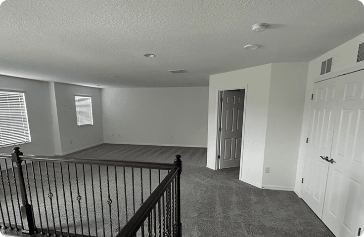
Ever walk into an office in Tampa or Brandon and instantly feel comfortable, or a little uneasy, without being able to explain why? It is rarely just the receptionist or the lighting. The walls are doing quiet work in the background. When office paint colors clash with your brand, look dated, or feel harsh under Florida’s bright natural light, clients notice even if they cannot name what is bothering them. And when the paint is scuffed, chalky, or stained from humidity, it can send an unhelpful signal that the space is not being cared for.
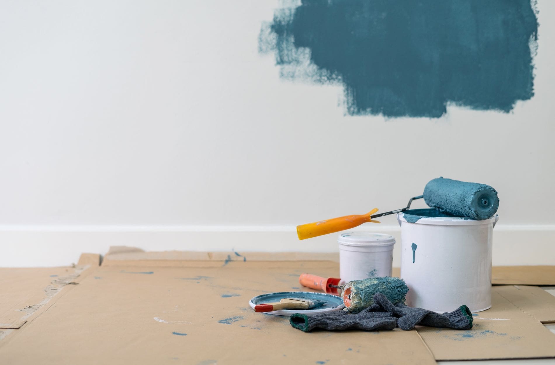
The good news is that paint is one of the simplest ways to reset that first impression. A thoughtful commercial repaint can make a space feel cleaner, calmer, and more professional without a full renovation. Peach Painting has helped businesses across Tampa, Valrico, Brandon, Riverview, Seffner, Plant City, and nearby communities since 2015, and we see it all the time. The right palette makes visitors relax, employees feel more energized, and the whole place reads as more trustworthy.
Why Office Colors Influence Clients More Than You Think
Clients form opinions fast. Before a meeting starts, they have already decided whether the space feels organized, current, and welcoming. Color is a big part of that because it is one of the first things the eye registers. Cool tones often feel steady and controlled. Warm tones often feel social and energetic. Neutrals can feel modern and focused, or sterile and flat, depending on the undertone and the lighting.
Florida light amplifies all of it. A shade that looks “soft” on a swatch can look icy in a sun filled lobby. A bold accent wall that looks fun at noon can look heavy at dusk under warm overhead lights. That is why the best office palettes are chosen in context, not in isolation.
There is also a practical layer that affects perception. Reception areas, hallways, break rooms, and restrooms take the most abuse. When those areas look freshly painted and easy to maintain, clients assume the business runs smoothly. When those areas look neglected, even by accident, it can create doubt. Paint is not the whole story, but it often sets the tone.
The Science Behind Color Psychology In Workspaces
You do not need to be a designer to use color well. Think of it like this: colors shape attention. They can make a room feel calmer, brighter, tighter, or more open. They can also change how people behave in the space. A conference room that feels balanced tends to support better conversation. A reception area that feels warm and clean tends to reduce that awkward “waiting room” tension.
Lighting is the other half of the equation. Sunlight shifts through the day, and every bulb type changes paint slightly. That is why zoning matters. A lobby has different goals than a workroom. A private office has different needs than a break area. Painting each zone with its purpose in mind keeps the space from feeling random.
Indoor air quality matters too, especially for occupied commercial spaces that need to stay comfortable while work is happening. Paint can contribute to indoor VOC levels while it dries. VOCs impact indoor air quality and products like paints and varnishes can be sources.
Best Colors For Boosting Mood And Client Appeal
There is no single “perfect” office color, but there are reliable choices that work well in Tampa area commercial spaces. The goal is to match the mood to the work, then make sure the finishes can handle real life.
Blue for calm trust: Blue tones can feel steady and reassuring. They work well for finance, medical, legal, and consulting spaces where people want clarity and confidence.
Green for balance: Greens often read as restorative and grounded. Great for wellness, counseling, and team areas where stress can run high.
Yellow pops for energy: A little yellow can brighten the mood and support creative thinking. Keep it to accents so it feels intentional, not overwhelming.
Clean neutrals that do not feel cold: Warm off whites, soft greiges, and modern taupes stay professional and keep the focus on people and branding.
Warm welcomes up front: Muted clay, sand, or soft peachy tones in reception can feel friendly while hiding minor scuffs better than stark white.
One helpful rule: pick your base colors first, then add one or two accents that support your brand. Too many strong colors can make a space feel busy and less premium, even if each color is nice on its own.
Step-By-Step Guide To Planning Your Commercial Painting Project
A commercial repaint goes best when you treat it like a project, not a last minute decision. Here is a simple plan Peach Painting uses with businesses throughout Tampa, Brandon, Valrico, and surrounding areas.
Figure your business feel first: Choose three words you want clients to feel when they enter (calm, modern, warm, premium, energetic). Let those words guide every decision.
Check the light you have: Walk the space morning, midday, and late afternoon. Note where sunlight hits hardest and where artificial lighting dominates.
Match brand and mood: Choose a base palette that fits your brand, then pick one or two accents for wayfinding, feature walls, or brand moments.
Put up big samples: Chips lie. Use large samples or test patches so you can see undertones, sheen, and how the color reads across the room.
Pick tough, healthier paint: Prioritize washability and scuff resistance for high traffic areas, and consider low VOC options when possible.
Avoiding Common Color Mistakes In Commercial Spaces
Most office color mistakes are not dramatic. They are small choices that add up.
Going too bold too fast is a common one. Intense reds and high saturation accent colors can feel exciting, but they can also raise tension in spaces where you want calm focus. Another common mistake is using pure white everywhere. In a sun heavy Florida office, pure white can glare and highlight every scuff. A softer white or warm neutral often looks cleaner for longer.
Treating every room the same can also backfire. Offices work better when zones match their purpose. A hallway might benefit from a slightly deeper shade that hides marks. A conference room might do better with a calmer tone that reduces visual noise. A break room can handle more warmth and personality because it is where people reset.
Finish choice matters too. Color gets the spotlight, but sheen affects how professional the walls look. Too glossy can show every patch and bump. Too flat can mark easily in high traffic. Matching finish to function is one of those “small” details that makes an office feel higher end.
And do not skip sampling. Tampa light changes everything, and repainting twice hurts a lot more than testing once.
Ready To Make Your Space Work Harder?
Smart commercial painting uses color psychology to support your business goals. It helps clients feel confident, helps teams feel comfortable, and makes your brand feel more intentional. In the Tampa Bay area, where sunlight is strong and humidity is real, good planning plus durable materials can be the difference between a paint job that looks great for years and one that shows wear too soon.
If you are ready to stop guessing and start shaping the way your space feels, Peach Painting can help with honest recommendations, careful prep, and clean professional results.